5 Design rules everyone should know
I never got on well with art when I was a kid. I didn't have a steady hand, which meant that I could never draw or paint well. My handwriting has always been abysmal, and I didn't have it in me to do better.
I was not an artistic person. Or so I thought.
After studying CS in college, I started working as a front-end engineer at Microsoft. Back then, front-end engineering was a blossoming discipline. Very few engineers worked in the land of CSS and Javascript, and almost nobody cared about design.
I got into design as a curiosity. I sure wanted to build better looking apps, but because I'm not an artistic person, I never thought to try...
...until...
one day, at the recommendation of a mentor, I picked up a book on design. I tore through it, gobsmacked by the revelations I was experiencing with each new page.
Friends, I am here to tell you: design is for EVERYONE.
Heck, grits is just corn
In software, 99% of the things that you might think of as "creative" are careful and deliberate application of basic rules. Sure, there's usually a bit of taste and color sprinkled in, but the basics are all science.
In cognitive science, we study behavior and functions of the mind. It has helped us make sense out of how humans think, and distill that into rules and patterns.
In UX, we use these to take advantage of how people interpret and experience software.
Once you understand some of these rules, you'll find it gets easier to write letters, design graphics, build products, etc.
Whatever it is you're doing, design can help.

5 Rules of design to give you superpowers
...no matter what it is you're doing. Seriously. From writing to graphic design to designing products for the web, I promise you'll find something helpful in here.
1. Hierarchy

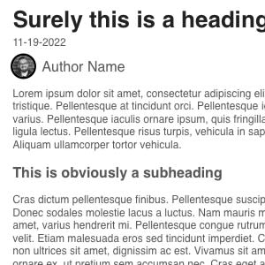
In western countries, we tend to read from top to bottom, left to right. It is something we've all been subconsciously trained to do since an early age.
When you're designing something, you can use this pattern to help guide your reader's eye. Assume they will go from looking at the biggest, boldest thing on the page, to the next biggest, and so on. You should therefore make sure that the most important things you want someone to see are the biggest and boldest, and step down from there.
This is called hierarchy. It's a way to help your guide your reader's eyes predictably.
2. Similarity

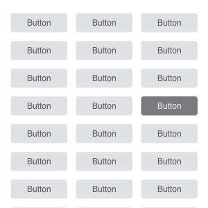
One nice thing about the way humans perceive things is that we use similarity to recognize things, and group them together. This comes from basic survival instincts - if you ate a fruit from a bush without getting sick, others that look similar are probably safe, too.
Apples to apples, literally.
Your reader will use similarity to group things together -- and just as well, things that are dissimilar will stand out like a sore thumb. Break similarity when you want to bring attention to something, like the most important action on a page. This is why you'll often see a "sign up" button in a different color than everything else on a given page.
3. Half the words, and then half again

Every one of us has a tendency to write too much. We want to be thorough, and we want to make sure we cover all the bases. The trouble is, our natural disposition to write long-winded descriptions is at odds with our readers' desire to get to the point. Cut down the words on the page to the bare minimum, by following Steve Krug's adage:
“Get rid of half the words on each page, then get rid of half of what's left.”
Here's how I might rewrite for the paragraph above:
When it comes to writing, less is more. Don't waste users' time by making them read. Get to the point, and be memorable.
4. Colors are math

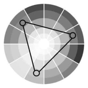
For me, this was a big one - colors, and the way they interact with one-another, are predictable. In other words, we can tell whether a set of colors are likely to be in harmony with one another based on where they fall on the color wheel.
There are many tools out there to help with this, too (see below for some examples). If you're working with a brand that has a specific color palette, you can use these tools to select colors that both complement and contrast the brand's colors.
You don't need to have a feel for colors - you can go a long way with the help of a calculator.
5. The Rule of Thirds

The Rule of Thirds comes from photography, where it's used to help guide the eye of the viewer. It's a simple rule: divide your image into thirds, both horizontally and vertically, and place the most important elements of your image on the intersections of those lines.
It's a shortcut to make your image look and feel great every time. You can do this with photos, graphics, and entire page layouts.
Colors, colors, everywhere
Color is a powerful tool, and a tricky concept to master. There are many tools out there to help you pick colors that work well together, and I've listed a few of my favorites below.
🎨 There are many color scheme tools available online to help you pick the right colors for your project. I really like Coolors for picking colors, and Color Hunt for finding inspiration. If you happen to be using Material UI, Google has some incredible docs on generating Material-friendly color palettes.
🧙 I'm a huge fan of @color.nerd on TikTok - he's a wizard when it comes to color theory, and does a great job of illustrating how colors interact with one another in the real world.
🧰 Did you know that about 1 in 12 men are colorblind? That's a staggering percentage - and it's why it's so important to make sure your colors are accessible to everyone. Stark is an accessibility tool that plugs into Figma, Sketch, and your favorite browser. It will help you make sure your designs are accessible to everyone.
📙 If you're ready to dive into more, the Color Design Workbook, by Terry Lee Stone, Sean Adams, and Noreen Morioka should be required reading. You'll get some great fundamentals of graphic design and color theory, and learn how to use colors in your designs.
📚 Ready to take a course on design? The squad over at The Gymnasium have a whole suite of free, online courses on design. Check out their UX Design Collection to get started.
Just enough to be dangerous
I hope you found something useful in here - and you can start applying these rules to your own work. If you did, please consider sharing this with your network, or sending it to a friend who might benefit from it.
If you're looking for more, I've got a few resources to keep you busy - check out my articles on design, and let me know what you think.
I'd love to hear your feedback, too. Did you learn something new? Are you thirsty for more? Let me know what you think, and I'll keep writing.
