The finicky nature of color in product design

Color can be used to convey a message, evoke an emotion, or even change the way a user interacts with a product. It can also be really difficult to get color right. There are cultural, historical, contextual, and even physiological factors that can influence how we perceive color.
Ever feel like you understand colors differently than you partner, or your best friend, or your mom? It's not just you.

Designers often face the challenge of unauthorized access to their designs, leading to intellectual property theft and loss of business. OneGlimpse offers a comprehensive solution to protect your designs by blocking unauthorized screenshots and screen recordings. With OneGlimpse, you can have peace of mind knowing your designs are safe and secure.
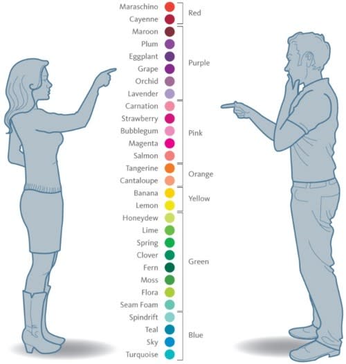
Color perception is a very personal experience. A 1995 study published in the scientific journal Perceptual and motor skills called Blue versus periwinkle: color identification and gender showed that "the women identified significantly more elaborate colors than did the men"*

The lesson: As you build your products, it's in your best interest to understand your audience. How do your primary users perceive color? What words do they use to describe their environment? Can you use an existing color taxonomy system or product palette that speaks to your user base? Understanding the value systems, language, and expression of your users can help you better design an interface that is intuitive, speaks to the user, and fits their needs.
* It's worth calling out that our cultural understanding of the nuance of gender in 1995 was not the same as it is today. There are many peer-reviewed papers with similar experiments going back as far as the 1970s. This particular study used a measure called "femininity" in its procedure. I have a feeling that if it were recreated today, they would choose more inclusive terms.
How many colors are there?
If you grew up speaking english, you might rattle off the colors of the rainbow: red, orange, yellow, green, blue, indigo, and violet.
The colors we see are a universal truth, right?
Well, not exactly.
Different spoken languages can have have drastically different numbers of colors. This is likely a result of to the cultural and historical contexts that surrounded the development of a given language.
Different linguistic groups with different levels of technological sophistication developed over time, and depending on the size of the group and the need for communication, different color terms emerged in different languages. For example, the Bassa language (spoken by about half a million people in western africa) has only two terms to describe color — roughly equating to “light” and “dark”.
In Homer's The Odyssey, the color the sea and the sky are famously described as "wine-dark", not because they were red, but because the ancient Greek language doesn't have a word for blue!
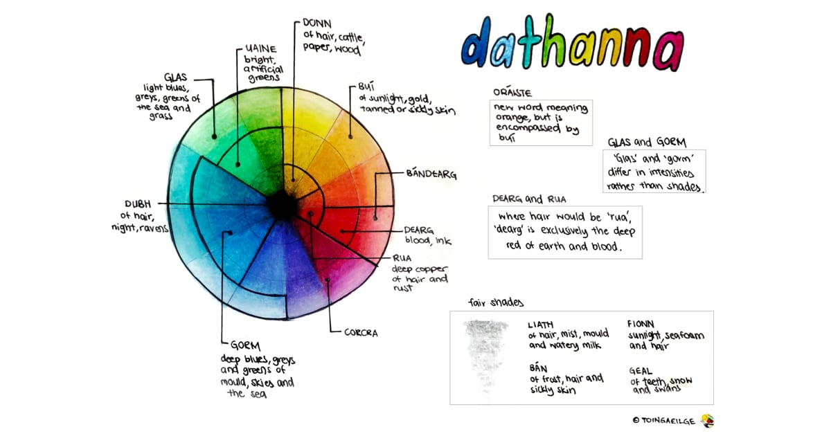
I love this diagram of the color wheel as described by the Irish language, which shows where various color words are placed on the wheel. It's a great example of how different languages can have different color.

The Wikipedia page for Color Term goes into much more detail about the history of color terms and how they have evolved over time. It's a great read.
Color and culture
As someone building a product for other people to use, it's important to understand the cultural context of your users. This is especially true in a world where our audience of customers can be spread across the globe. Just as you might have a different understanding of color than your partner, your users might have a different understanding of color than you.
For this reason, it can be helpful to build early product prototypes and mockups in greyscale - using different shades of grey to represent different elements of your design. This can help you focus on the hierarchy of your design before layering on your brand colors.
More colorful wisdom
-
🎨 Did you know that 7-10% of men are red-green Colorblind? Putting red and green elements adjacent to one another in your designs can be difficult for some users to distinguish.
-
📖 For some great books on color in design, take a look at Color Design Workbook and 100 Things Every Designer Needs to Know about People.
-
🙌🏻 One of my favorite tools for evaluating use of color in your designs is Stark. It comes in the form of a plugin for things like Figma, InDesign, and all of the popular browsers, and uses WCAG and ADA standards to assess the accessibility of your designs.
My work online this week
-
⌨️ I've been getting deeper into the world of TypeScript, and have been trying to document tricks and patterns that I've found helpful along the way. Refactoring TypeScript React components in VS Code is a blog post showcasing how I use VS Code to refactor a React component from a class-based component to a functional component.
-
📼 I also published a YouTube short showing How to add TypeScript to your existing Next.js project - it's surprisingly easy!
-
🥳 This last bit is indirectly my work, but I wanted to share anyway - we published our first couple articles online for my new company, Craftwork. If you're interested in home painting, check them out! This also marks the beginning of a new journey into SEO and content marketing - building up a domain's authority and ranking for relevant keywords from scratch. I expect to share some of my learnings in the months to come.

